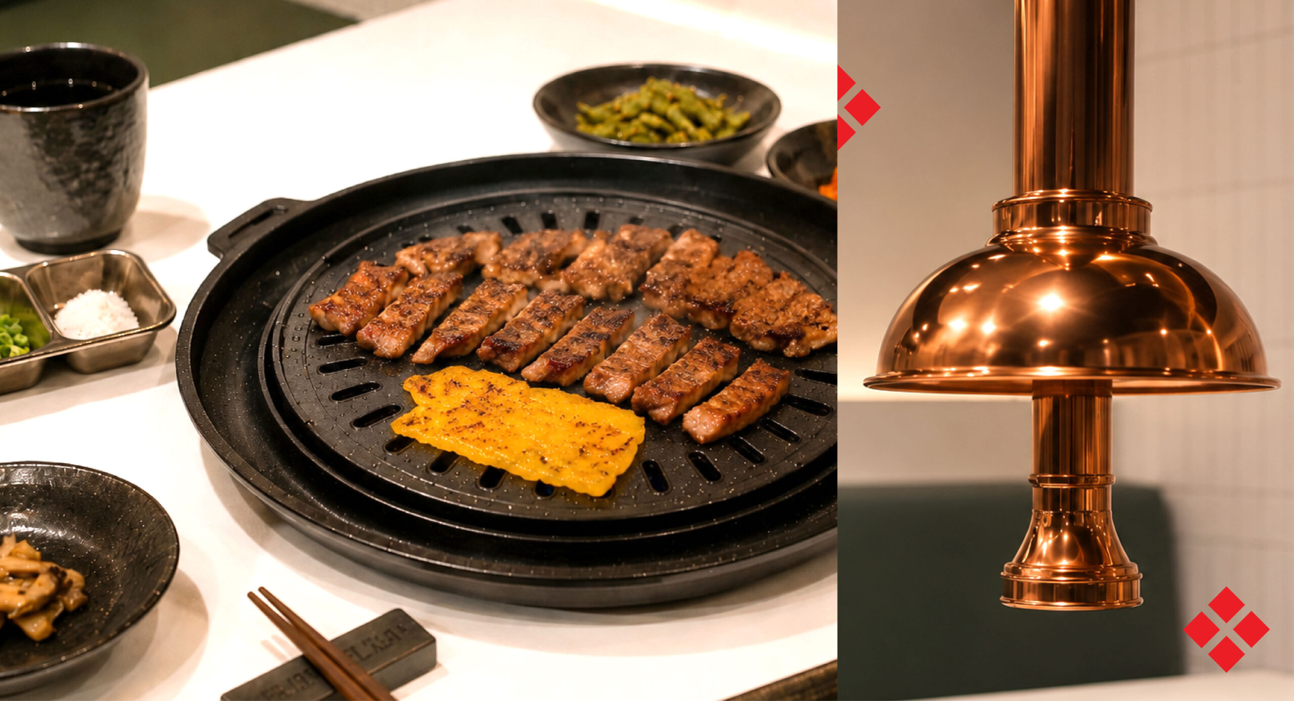
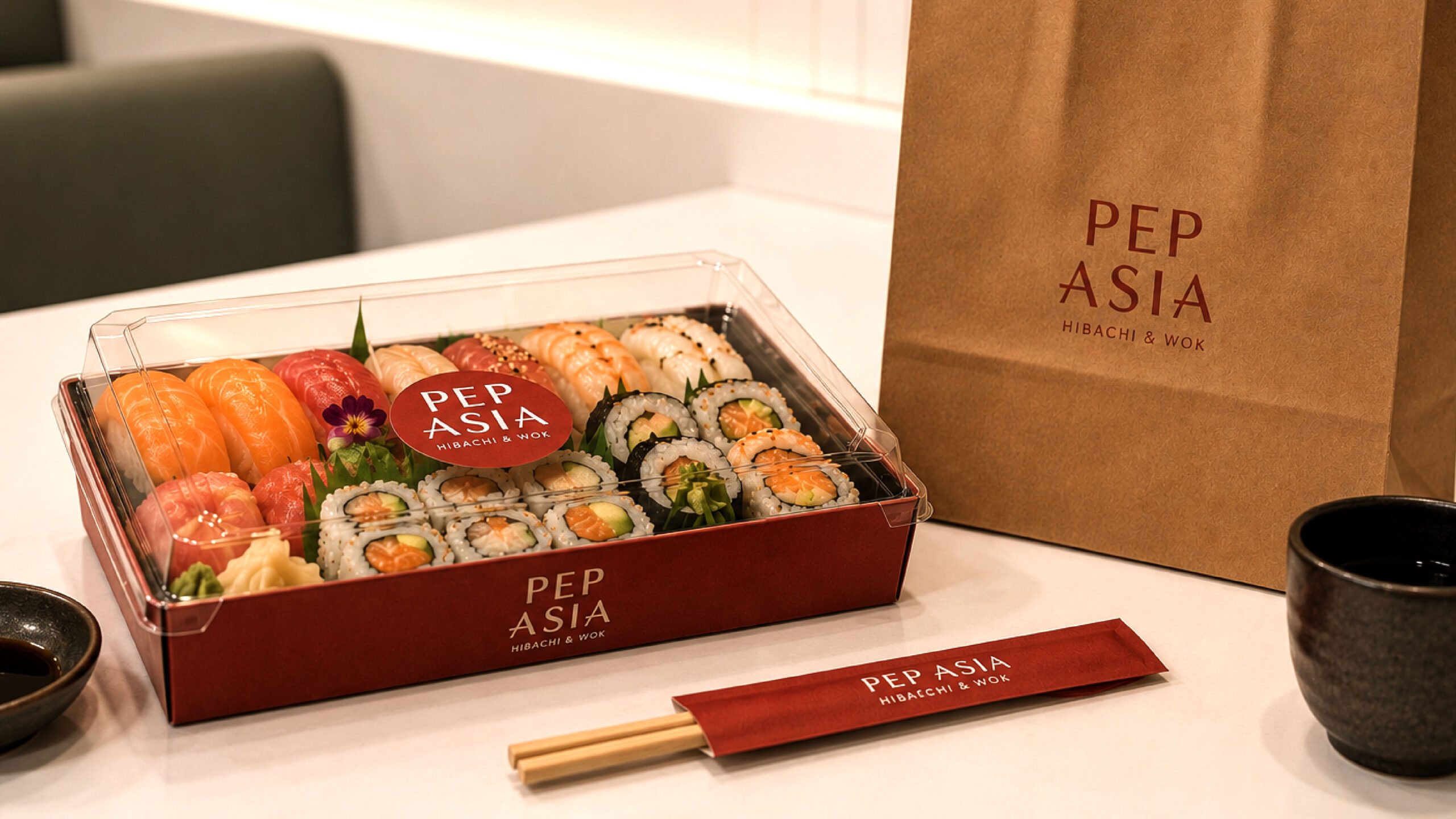
Brand identity for a Pan-Asian restaurant bringing the theatre of hibachi and wok cooking to a more accessible dining experience.
Client: Pep Asia
Scope of work: Branding
Pep Asia evolved from a cloud kitchen into a physical restaurant, marking an opportunity to establish a cohesive identity that reflected its expanded offering.
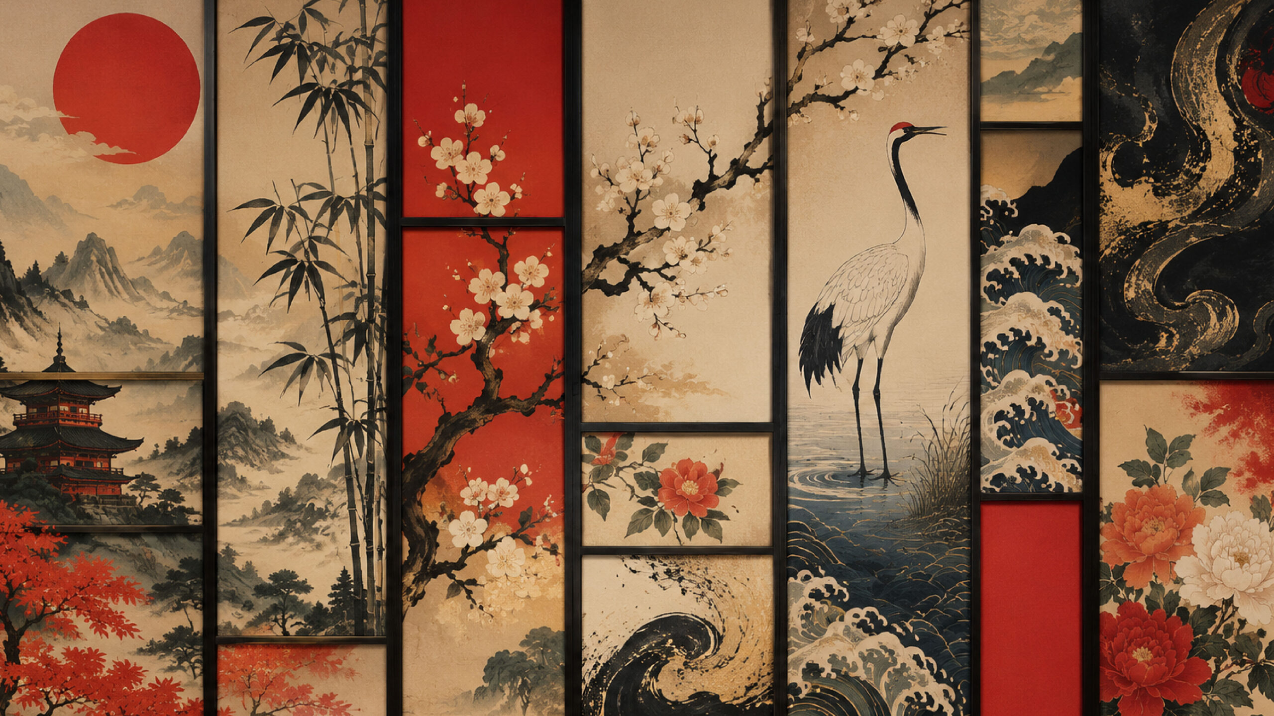
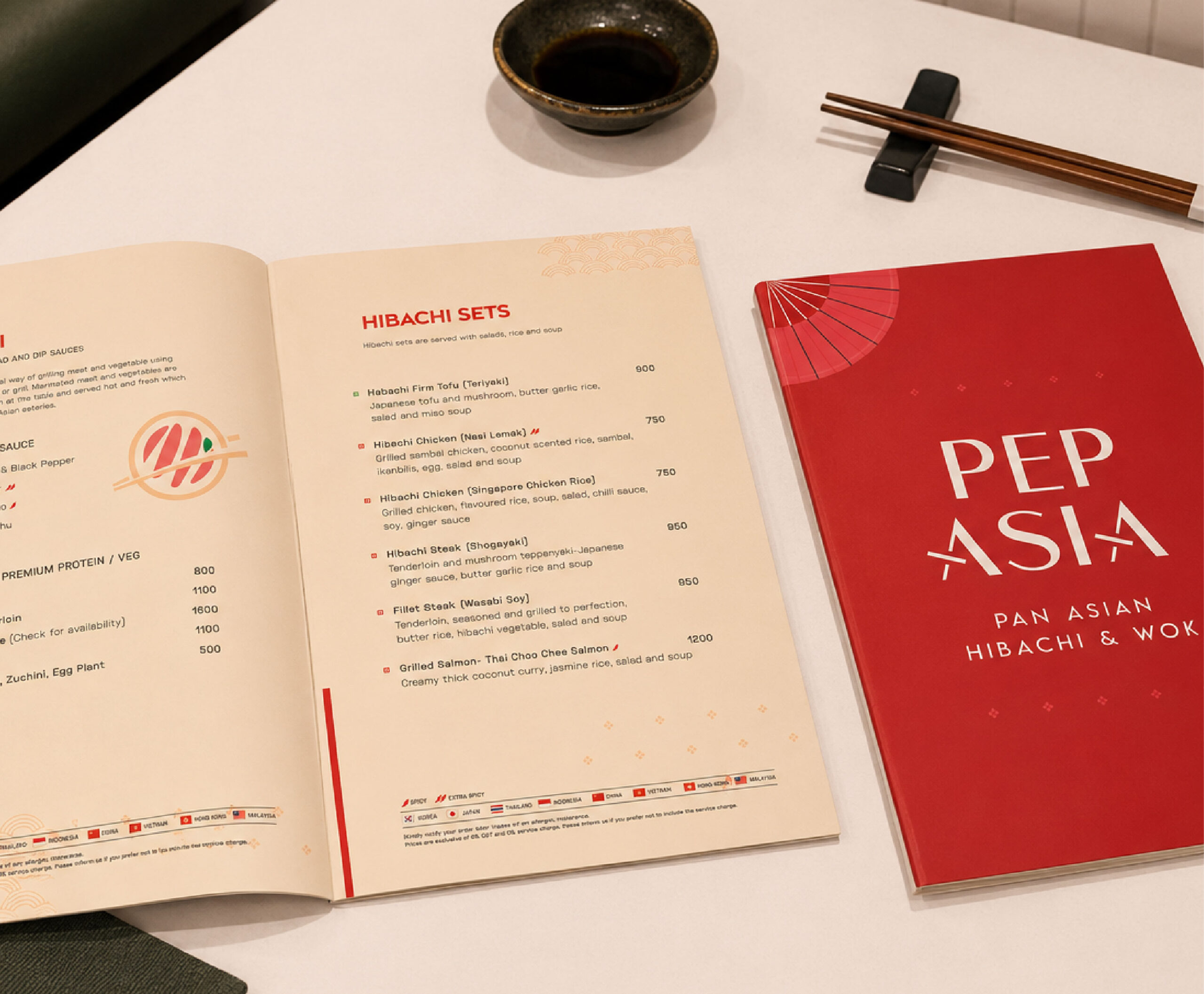
The visual identity balances contemporary simplicity with familiar Asian references. A refined serif wordmark lends the brand confidence, while subtle interventions, such as chopsticks intersecting the letterforms introduce cultural cues. The rich red palette draws from colours commonly associated with celebration, warmth, and hospitality across many Asian cultures, while restrained graphic elements create a cohesive visual system that extends naturally across menus, packaging, and in-restaurant applications.
The menu was designed as an extension of the brand experience. Country indicators, spice markers, and custom illustrations help diners identify the origin of each dish and navigate a diverse Pan-Asian menu with ease.
Every project begins with clarity and ends in form. See how we have helped brands turn ideas into purposeful design.